Information Center
Charting
How do I quickly create a chart?
The Information Center allows you to integrate charts in any non-pivot report. To do so, just enable the checkbox called "Add Chart" in the "General Report Settings" part of the IC report editor (at the very bottom on the left hand side):
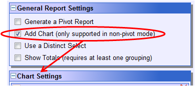
Enabling the chart feature, will open a new component just below the general settings. This component is called "Chart Settings" and allows you to configure your chart. Please note that you can only add a chart to a report if the report is not already configured to be a pivot/summary report (i.e. if the first checkbox in the above screenshot is ticked).
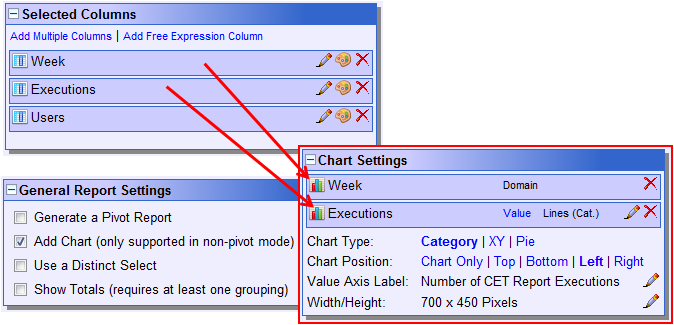
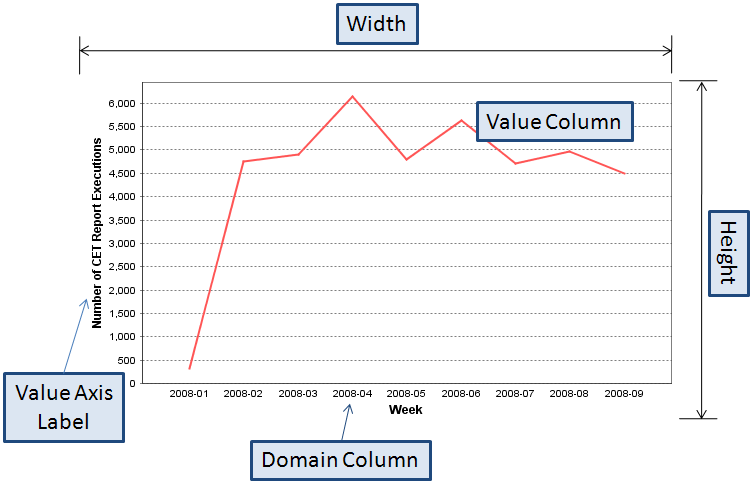
In order for a chart to work correctly, at least two chart dataset columns need to be added. One column (the domain column) is providing the different values displayed on the X axis and subsequent columns (the value columns) provide some data related to the different domains. E.g. if your domain are the different departments, the value column should provide some related value - for instance the amount of staff for each department.
There must be always one domain column and there can be as many value columns as needed. Please be aware that the value columns must always return numeric values. Otherwise, they cannot be rendered in the chart. Domain columns must only be numeric if used together with an XY chart type.
In the above example, the two columns "Week" and "Executions" have been dragged to the chart settings panel. The "Week" column provides the domains and the column "Executions" the number of executions per week.
Position of the chart
First of all, charts are only available when the output options HTML or PDF are selected. In Excel or XML, you always get the raw data in tabular or XML structured form returned. For the HTML and PDF formats you can select:
- Whether you want to have a chart only in the report. I.e. no data table would be shown.
- Or whether you want to have the chart appear at the top, the bottom, the left or the right of the data table.
Chart configuration in detail
The following screenshot illustrates the impact the different chart configuration options have on the generated chart.
If more than two value columns are available in the chart, a legend will be automatically added to the generated chart. How the values of each value column are represented depends on the used chart type. You can select between three different chart types:
- Category charts
- XY charts
- Pie charts
Category is the most widely used chart type and fits most needs. Its advantage is that it only displays the values on the X axis that are actually returned by the underlying query. It does not try to be clever and it is not limited to a numeric scale.
XY charts are of interest if more scientific charts are being computed. The domain must be numeric and the range always starts from 0. It is very well suited for charts where there is more than one series value for a single domain.
As the name states, pie charts are used to render results in a pie. Pie charts only accept a single value column which is the major difference between the pie and the two other chart types.
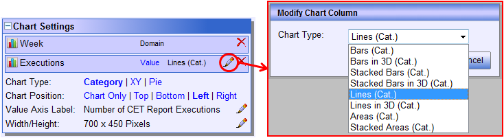
Depending on the selected chart type, different render types are available for the selected value columns. In order to change the render type for a particular value column, you should click the small edit button (pencil) next to the desired value column:
For category and XY charts, different render types can be combined in the same chart. However, you - as the report creator - are responsible for ensuring that the chart's configuration makes sense and matches the data you want to represent graphically. The charting support in IC allows you to click together any kind of chart. It is up to you to ensure that it is semantically correct and suits the purpose it is intended for.